The Final Cut - "Lone Star"
“Lone Star” is a film opening meant to bring awareness of the judgmental way of thinking regarding the LGBT community, especially teenagers, and the problems they are facing. It is a story about the relationship of two teenage girls which the main character’s mother doesn’t approve.
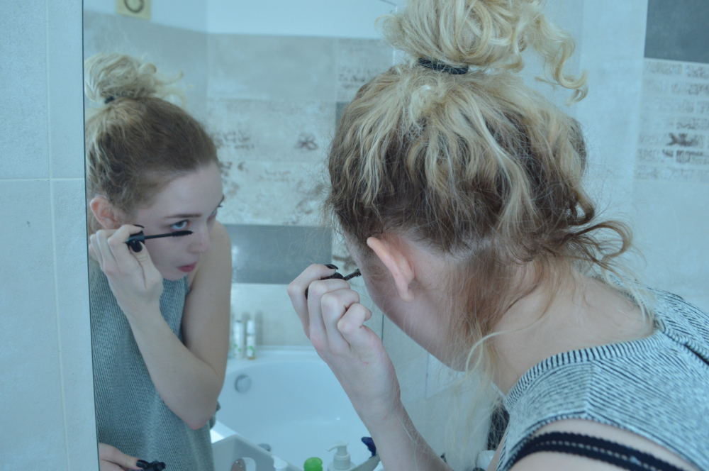
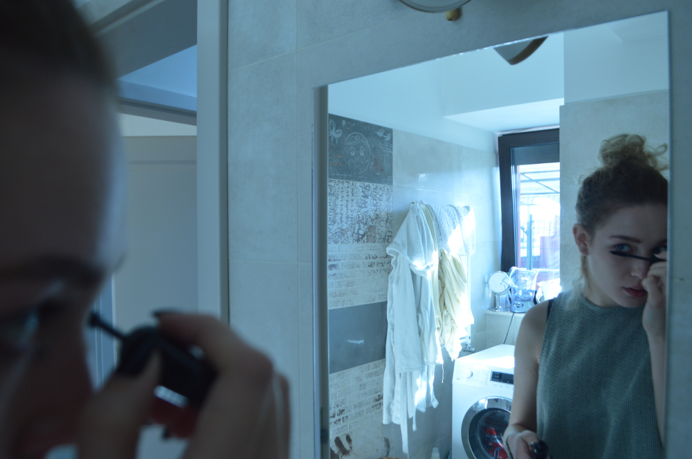
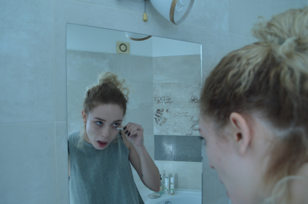
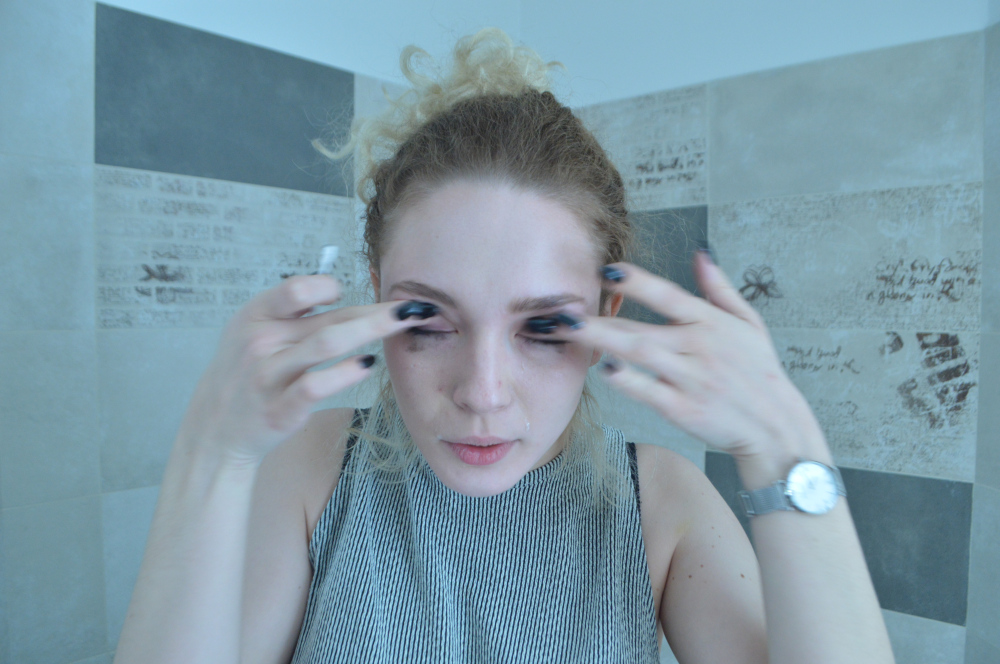
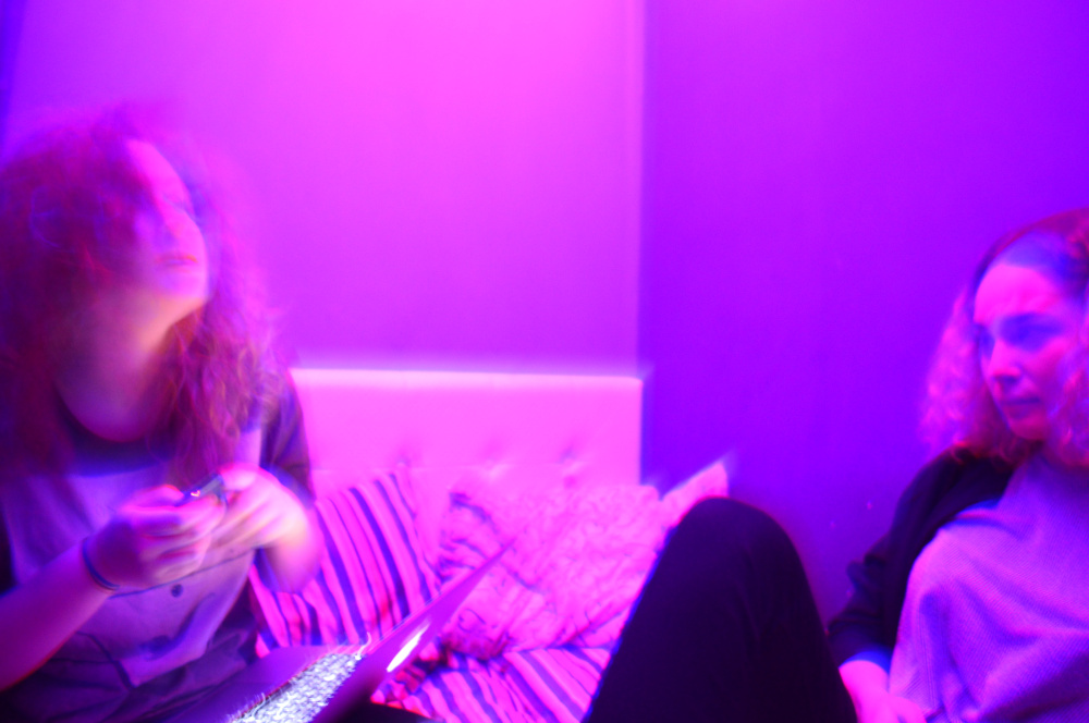
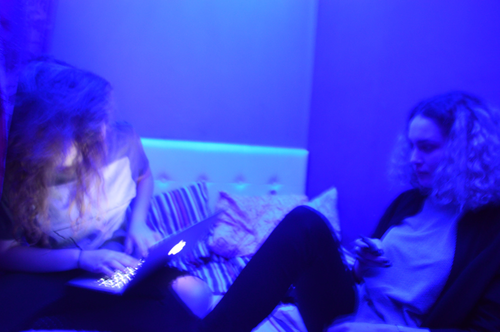
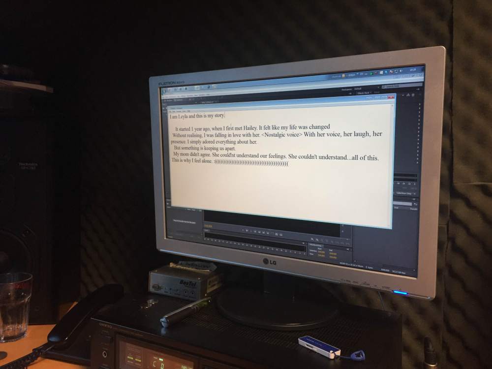
This film opening shows the protagonist’s grief while remembering happy moments of her and her lover. There is a visible contrast between the flashbacks and the shots in which she is sad, given by the warmer and colder colours respectively.
The shots under the neon lights are “trespassed” by horizontal lines intentionally. This is because we wanted to express the fact that those memories are blurry and disturbing for the main character – memories she wants to forget.
Enjoy!
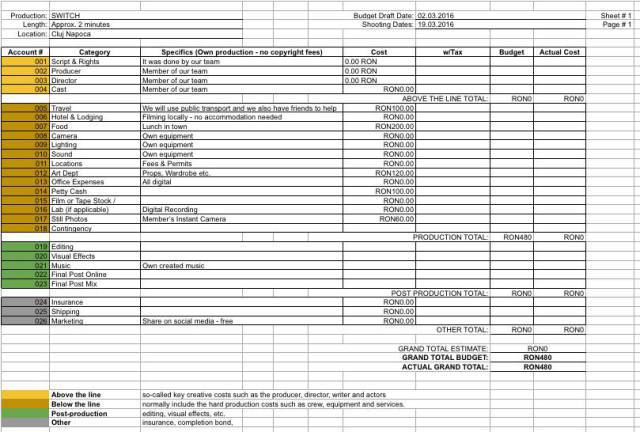
Budget Sheet
The Title Font
For the fonts, we looked through (too) many pages of different styles. Dafont is a website which allows you to preview your word(s) using different fonts and compare them. It was really useful for us to see which would suit our opening better.
As simple as it seems, it was actually a tough decision. In the end, we decided that the fonts we are going to use for the credits and our production company name are going to be classical. This is mostly because we want the audience to concentrate on the actual story and not other details.
Regarding the title of the movie, we chose a really bold, eye-popping font, as the narration will end by the time the title will appear. We agreed on this because we want the viewers to remember our film.
Changes
As it is normal to be open-minded to last minute changes, we had to adapt to the production process and this is what we have done:
Characters – “Hailey”, the protagonist’s lover, wasn’t available for filming anymore and so, Mara, who is part of our production crew, and also friends with the main character’s actress was most suited to play this role. This wasn’t a problem, it was actually really good to have someone who already knew what is going on and how we wanted it to look like. Also, we decided that the mother’s voice was not that relevant and we stick only with the sound of the opening door; the narration of the protagonist is descriptive enough for the situation.
We modified the script; the narration of the main character was written again, this time more profound and closely linked to the shots, in order for the audience to understand the story.
Lastly, we found a much more appealing way to combine the shots and in the end it turned out to show our vision of the film opening better than the moodboard we created in the beginning. Their order was slightly changed and some were cut and inserted in between others.
It wasn’t a surprise that our production suffered these kind of changes, but we were able to managed it well and we are proud of our accomplishment.
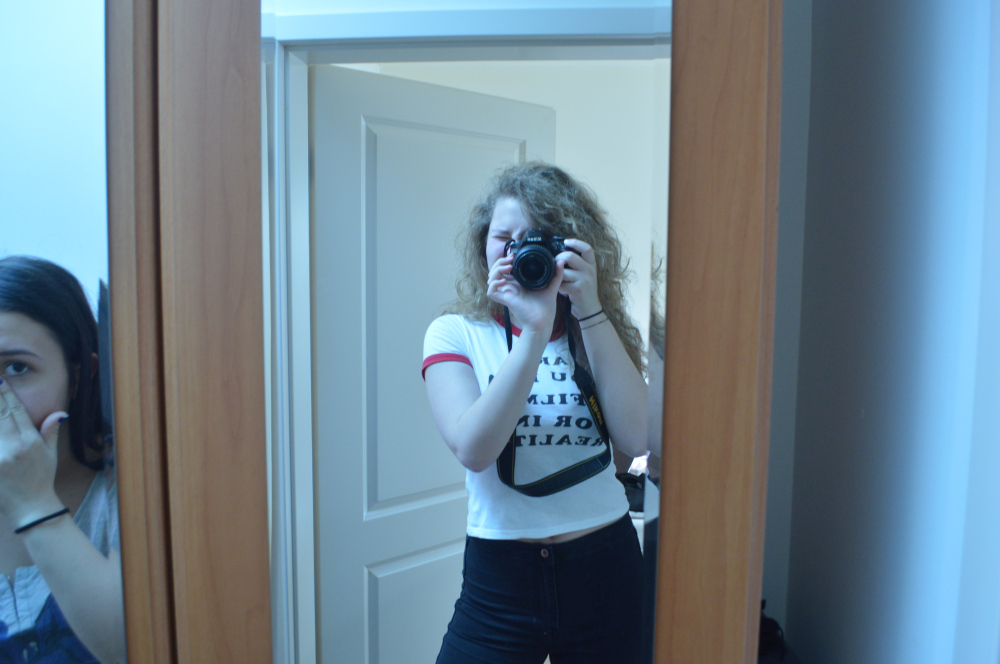
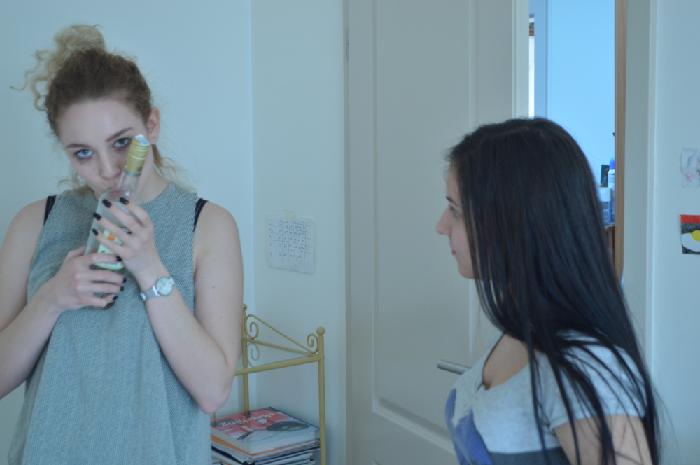
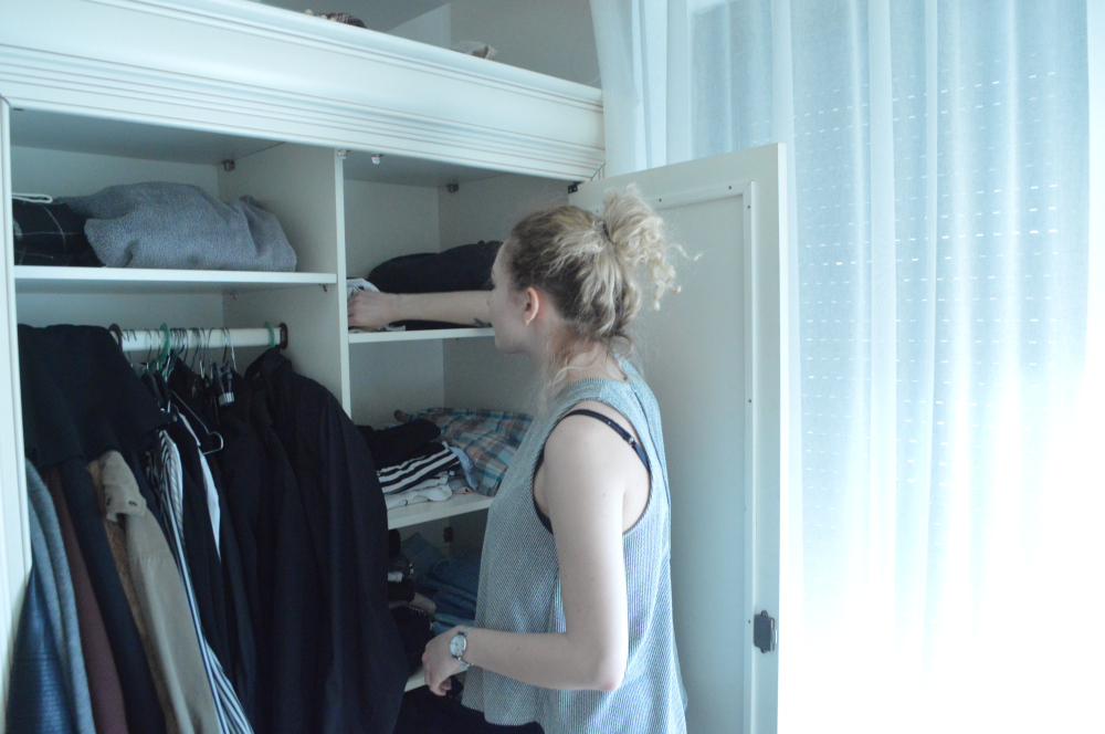
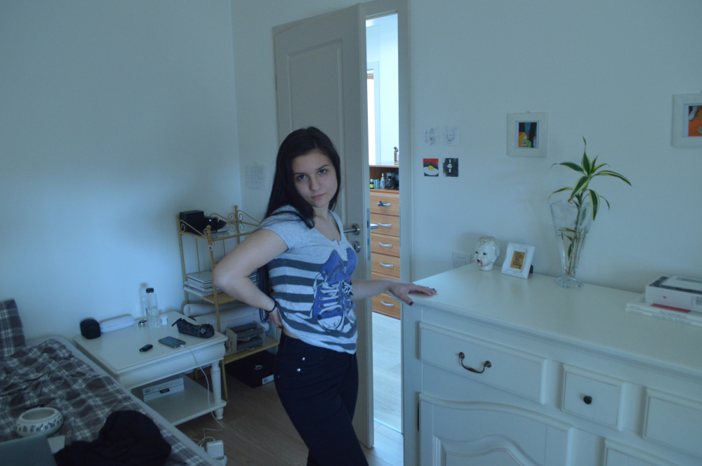
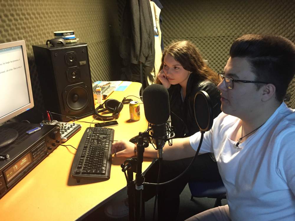
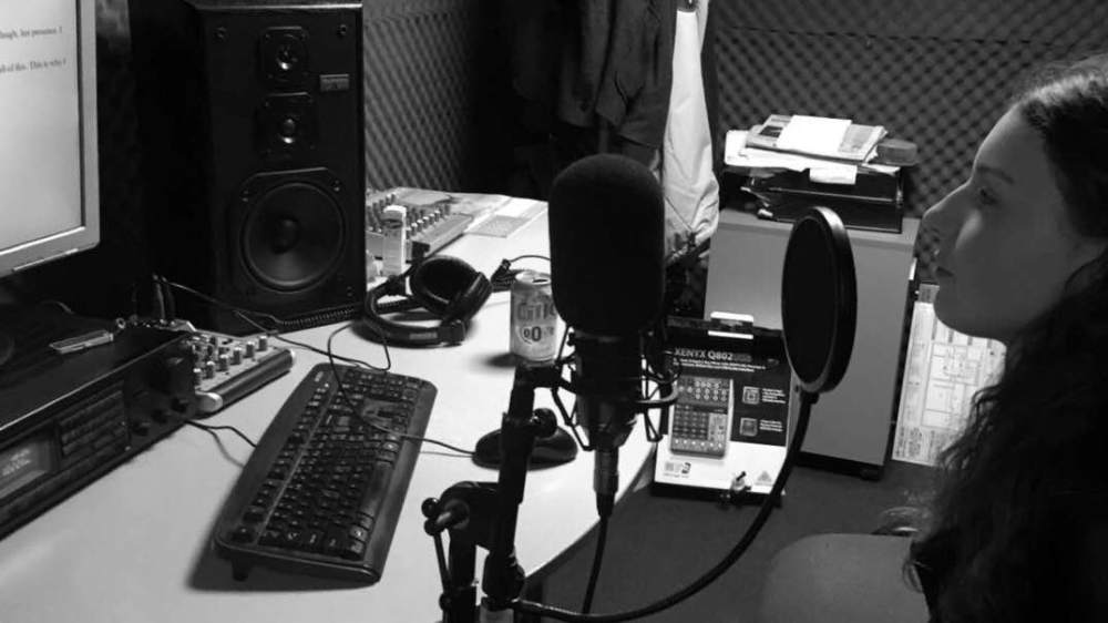
Making Of
Rough Cut
Budget

Location
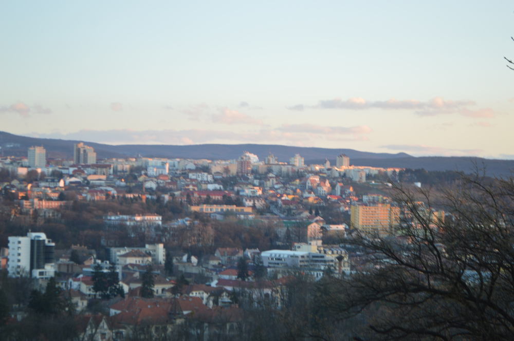
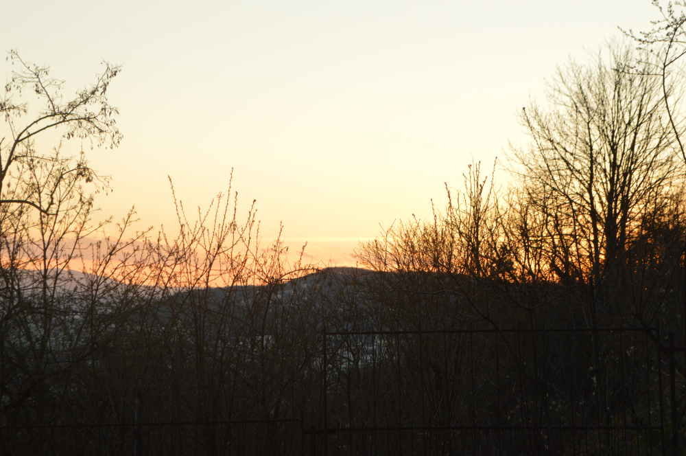
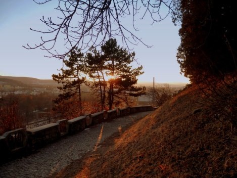
The first flashback location is Cetatuie, a popular place in Cluj, where you can see the whole city. The sunsets are visible there and it would give a sense of romance to the story. We will film a shot in which they are holding hands while looking at the sunset. No one else will be in the shot so it will highlight the intimacy.
The second flashback shot will be filmed in one of the parks in Cluj, The Central Park. They will be seen in a hammock hugging each other. The sun will be shining and they will be glowing. This is one of their happy times so the weather is important in order to inspire that.
